When selecting a white shade, consider the undertones within the colour. A blue-based white will make a room feel brighter and cooler, a brown-based white will bring warmth and cosiness to a space, a green-based white will bring a fresh feel to a room and an off-white will provide a more subtle, muted tones, an excellent alternative to brilliant white.
The Bert & May x Little Greene Colour Palette
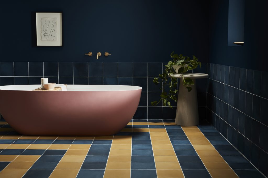
Royal Navy
A sumptuous blend of Royal Blue and Navy Blue, this shade can used in place of dark grey or black in an otherwise neutral colour scheme.
Bassoon
The deep-ochre hue, Bassoon brings an element of joy to a space
Aquamarine
Our Aquamarine Colour Scales family provide a soothing blend of blue-green that exude tranquility. This pairing also works beautifully alongside the muted Livid and contrasting Purple Brown tiles.
Purple Brown
Purple Brown is an original, sumptuous Victorian shade which brings depth to a scheme for a relaxing sanctuary space.
„
It’s been a real joy to collaborate with Bert & May on this project. It’s wonderful to see some of our much-loved paint colours transformed into a new medium. The crafted nature of their production makes each one something to cherish, and we’re really excited to see some of the resulting transformations – with beautiful colour truly being embraced on every surface”
Ruth Mottershead, Little Greene’s Creative Director
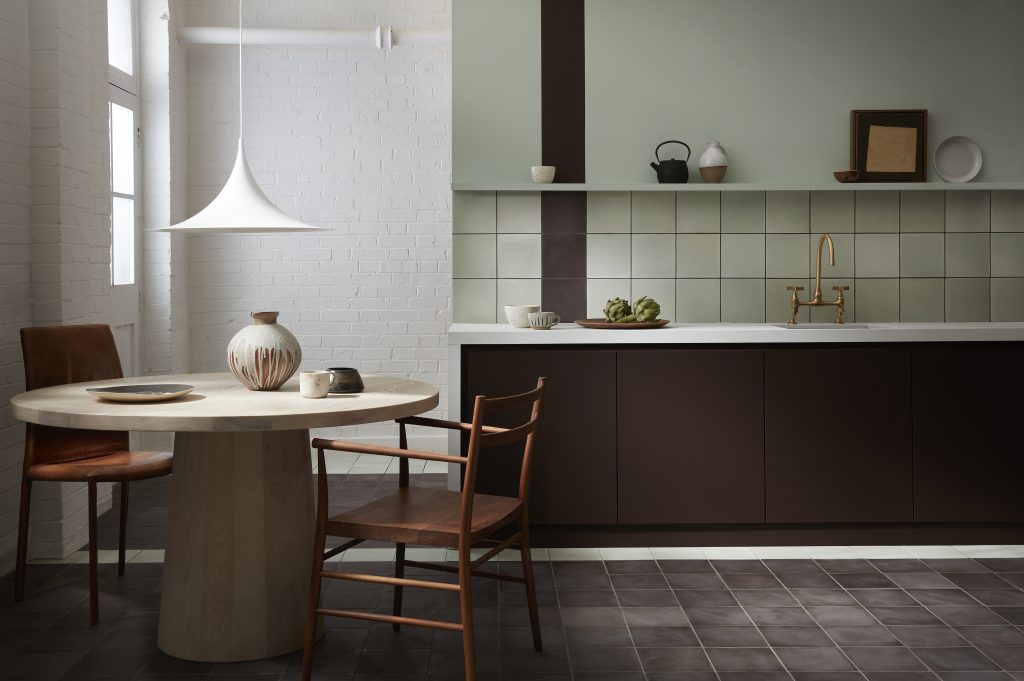
Chemise
A sophisticated pink shade, Chemise brings warmth and intimacy to a space, appearing muted and chalky on Bert & Mays signature cement squares, or glamourous with a glazed finish. Use alongside the French Grey Colour Scales family for a harmonious finish.
French Grey Colour Scales
The incredibly versatile French Grey is not too yellow, pink, blue or green and works in almost any scheme.
All eight colours are available in either 7.5 x 15 cm glazed herringbones, or 20 x 20 cm cement squares from Bert & May, providing depth, contrast and harmonious coordination with their partnered Little Greene paint colours.